
Creating a Chart
You can also drill up and drill down on charts.
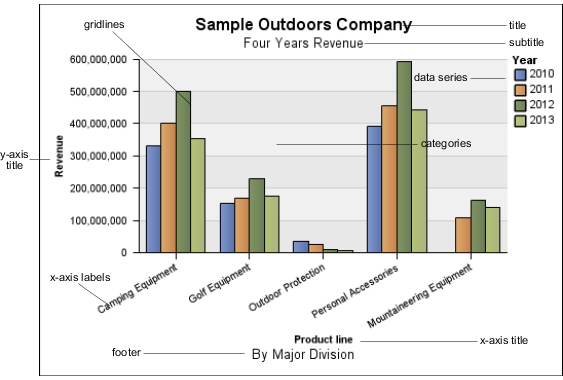
Charts plot the crosstab rows as the data series. Nested rows appear as joined items in the legend. Stacked rows appear sequentially in the legend.
Charts plot the crosstab columns on the x-axis. Nested columns are clustered on the x-axis. Stacked columns are plotted sequentially on the x-axis.
Charts plot a single measure on the y-axis.
If you have the necessary permissions, you can enhance your chart in IBM® Cognos® Report Studio. You can change the appearance of the columns, lines, and areas; add notes and baselines; or customize the chart properties to present the chart more effectively. For more information, see the IBM Cognos Report Studio User Guide.
For information about charts, see Chart Types.
Chart Hotspots
When you pause the pointer over the hotspots of
a chart, visual elements appear, such as tooltips and the plus sign
(+) and caret  that indicate drill-up/down ability.
The response time for showing a chart increases as the number of hotspots increases. The administrator can configure IBM Cognos Analysis Studio to limit the number of hotspots returned to provide improved performance. For more information, see the IBM Cognos Business Intelligence Administration and Security Guide.
Prioritization is given to generating hotspots for items such as axis labels and legend labels before individual graphical elements such as bars, pie slices, and so on. Depending on the number of items in a chart and the current setting for the maximum number of hotspots, some axis items may have hotspots while other axis items and all graphical elements do not, or all axis items and some graphical elements may have hotspots while other graphical elements do not.