Quadrant Charts
Quadrant charts are bubble charts with a background
that is divided into four equal sections. Quadrant charts are useful
for plotting data that contains three measures using an X-axis, a
Y-axis, and a bubble size that represents the value of the third measure.
You can also specify a default measure. For example, you might need to specify a default measure to give context to a calculated measure in the chart. For more information about the default measure, see Specify the Default Measure.
Legacy quadrant charts use baselines to create the quadrants. Current default charts use colored regions.
Use a quadrant chart to present data that can be categorized into quadrants, such as a SWOT (strengths, weaknesses, opportunities, and threats) analysis.
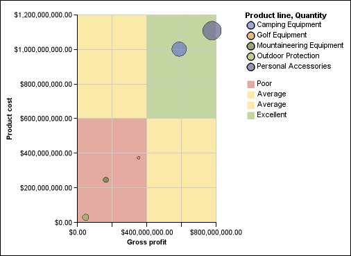
The following example shows the relationship between production cost and gross profit. The size of the bubble represents the quantity of units sold.