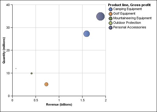
Bubble Charts
Bubble charts, like scatter charts, use data
points and bubbles to plot measures anywhere along a scale. The size
of the bubble represents a third measure.
You can also specify a default measure. For example, you might need to specify a default measure to give context to a calculated measure in the chart. For more information about the default measure, see Specify the Default Measure.
Bubble charts are useful for representing financial data. These charts are not supported for Microsoft Excel output.
The following example plots quantity and revenue by product line. The size of the bubble represents the amount of gross profit.
Figure 1. Bubble chart