
Line Charts
Line charts are useful for showing trends over
time and comparing many data series.
Line charts plot data at regular points connected by lines.
Line charts can plot data using standard, stacked, 100 percent stacked, and three-dimensional configurations. It is best not to use stacked line charts because they are difficult to distinguish from unstacked line charts with multiple data series.
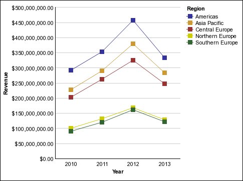
The following example shows a revenue trend that peaked in 2012 in every territory.
Note: The Top Retailers by Country or Region sample
report Top Retailers by Country or Region in
the Sales and Marketing (cube) package includes a line chart. For
more information about The Sample Outdoors Company samples, see Sample Reports and Packages.