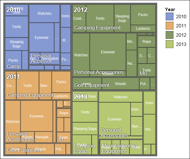
Adding a treemap visualization
Treemaps show relationships among large numbers of components by using size and color coding in a set of nested rectangles.
A treemap that is colored by category identifies the level 1 category by color. The sizes of the rectangles represent the values. In a treemap that is colored by value, the sizes of the rectangles represent one of the values and the color represents a second set of values.

Before you begin
Your administrator must make the visualizations available in the Visualization Gallery.
If you use Microsoft Internet Explorer to view visualizations, you must have Microsoft Silverlight 5 installed on your computer. Firefox or iPad users do not need Silverlight.
About this task
You add data to a visualization by inserting data items in drop zones.
When you add a visualization to an IBM® Cognos® Active Report, you can choose to render visualizations on the IBM Cognos server or on the client. When you choose to render visualizations on the client, additional drop zones appear for extra categories or values when all the required drop zones contain data items. You can use extra categories and extra values to filter data or set variables. Extra items are not visible in the visualization.
When working with dimensional data sources, if the visualization does not contain a measure against which to plot data, you must provide one. For example, if you add a single member to the values drop zone, such as '2012', the default measure drop zone appears in which you must insert a measure.

 , drag
a
  to the work area.
 , drag
items to the appropriate location in the data container: