Bubble Charts
Bubble charts, like scatter charts, use data
points and bubbles to plot measures anywhere along a scale. The size
of the bubble represents a third measure.
Bubble charts are useful for representing financial data. These charts are not supported for Microsoft Excel output.
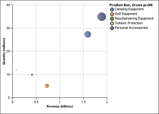
The following example plots quantity and revenue by product line. The size of the bubble represents gross profit.
Figure 1. An example bubble chart