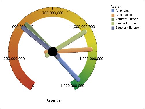
Gauge Charts
On a gauge chart, the value for each needle is read against the colored data range or chart axis. This chart type is often used in executive dashboard reports to show key business indicators.
Gauge charts are useful for comparing values between a small number of variables either by using multiple needles on the same gauge or by using multiple gauges.
Reports in PDF or HTML format are limited to show a maximum of 16 pies or gauges per chart. These charts are not supported for Microsoft Excel output.
A gauge chart consists of a gauge axis (which contains the data range, color ranges, and intervals markers), needles, and a center pivot point. The following example shows a basic gauge chart with default attributes. It is a degree dial chart with two axes.