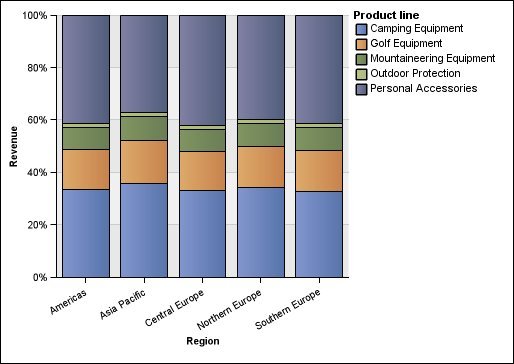
100 Percent Stacked Charts
100 percent stacked charts are useful for comparing
proportional contributions across all categories. They plot the relative
contribution of each data series to the total as a percentage. For
example, a 100 percent stacked column chart that plots product line
sales emphasizes the percentage within each region without referring
to actual values.
You can distinguish each data series by the color or pattern of its section in the stack. Each stack represents 100 percent.
100 percent stacked charts highlight proportions. When actual values are important, use another chart configuration.
The following example shows the percentage of sales for each product line in each region.
Figure 1. An example 100 percent stacked chart