Stacked Charts
Stacked charts are useful for comparing proportional
contributions within a category. They plot the relative value that
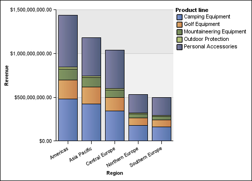
each data series contributes to the total. For example, a stacked
column chart that plots product line sales will emphasize the proportion
that each product line contributes to the total in each territory.
You can distinguish each data series by the color or pattern of its section in the stack. The top of each stack represents the accumulated totals for each category.
Do not use the stacked configuration in line charts that have multiple data series because it is difficult to distinguish between unstacked and stacked configurations, and your chart consumers might misunderstand your data.
The following example shows that camping equipment contributed a large proportion of the actual revenue in most sales territories.
Figure 1. An example stacked chart