Standard Charts
Standard or absolute charts are useful for comparing
specific values and for representing discrete data, such as data for
different regions or individual employees. For example, a standard
column chart that plots regional sales emphasizes the actual value
that each region achieves in sales.
Standard charts plot the actual value of each data series from a common axis.
When you create charts using multiple data series, you can distinguish each series by the color or pattern of its data marker. Related data series are shown together in clusters for easy comparison.
In standard area and radar charts that have multiple data series, the colored areas that represent lower values might be covered by the larger colored areas that represent higher values. Use the stacked configuration for area and radar charts with multiple data series.
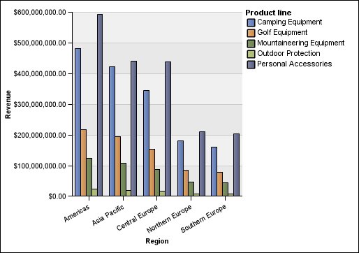
The following example shows the revenue values for each product line within each territory.
Figure 1. An example standard chart that compares
specific values