
Pareto Charts
Pareto charts help you to improve processes
by identifying the primary causes of an event. They rank categories
from the most frequent to the least frequent. These charts are frequently
used for quality control data, so that you can identify and reduce
the primary cause of problems.
Pareto charts include a cumulation line, which shows the percentage of the accumulated total of all the columns or bars.
You can create before and after comparisons of Pareto charts to show the impact of corrective actions. These charts are not supported for Microsoft Excel output.
The following example shows that the most frequent reason for product returns is unsatisfactory product.
Figure 1. An example pareto chart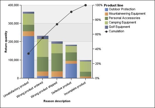
You can also create Pareto charts using horizontal bars.