In a scatter or bubble chart, you can specify
that data points or bubbles appear in different colors that are based
on an additional measure or fact. The color of the points or bubbles
helps you to see relationships in large amounts of data.
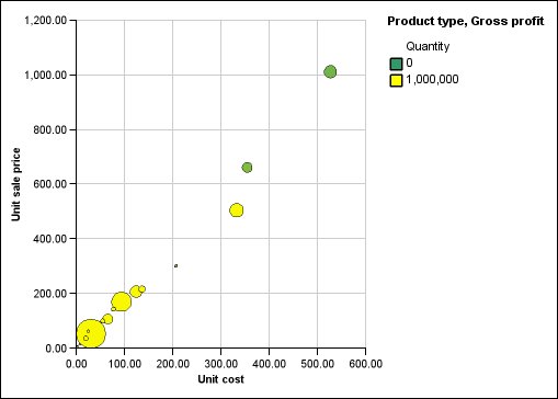
For example, the following bubble
chart shows the relationship between the unit cost and unit sale price.
The size of the bubbles shows the gross profit and the color of the
bubbles shows whether the quantity sold is above (yellow) or below
(green) 1,000,000 units.
Figure 1. Example
of a bubble chart that shows values in different colors
Procedure
- Drag a measure to the Color drop
zone under Measures and then select the measure.
- In the Properties pane, click Color
by value.
- To define the colors by percentages instead of actual values,
select the Percentage check box.
For example,
if you select the Percentage check box and
your values range from 25 (red) to 50 (green), the bottom 25 percent
of values are red and the top 50 percent of values are green. The
values between 25 percent and 50 percent are an interpolated color,
such as yellow.
- If you want to use a preset color palette, click Palette,
and select the palette that you want to use.
- If you want to customize a palette color or boundary value,
select the palette entry in the Palette box,
specify the color and transparency, and type a new boundary value.
- To change the color and transparency of the palette definition:
- To add a palette entry, select the palette entry below
which you want to add the new entry, click the new palette entry icon
 , and
click Color.
, and
click Color.
- If your chart has lines or markers, under Style,
set the marker shape, line style, and line weight.
- To choose a color and transparency for missing or null
values, under Missing Values, click Color and
type a value in the Transparency box.