
Crosstabs
Use crosstab reports, also known as matrix reports,
to show the relationships between three or more query items. Crosstab
reports show data in rows and columns with information summarized
at the intersection points.
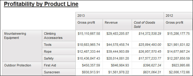
For example, the following crosstab shows the gross profit and revenue by product line for each year.
Tip: The Same Month Prior Year sample report in the Sales
and Marketing (cube) package includes a crosstab. For more information
about The Sample Outdoors Company samples, see Sample Reports and Packages.
- Crosstab Nodes and Crosstab Node Members
When you add data items to crosstabs, you create crosstab nodes and crosstab node members. These objects allow you to easily create crosstabs, by dragging data items to crosstabs. - Set Crosstab Properties
Format crosstabs to give them the appearance you want. You can specify formatting for rows, columns, and fact cells in a crosstab or for the entire crosstab. When you specify formatting for all rows, columns, fact cells, or the crosstab, the formatting is automatically applied to any new items you add. - Create a Single-Edge Crosstab
Create a single-edge crosstab report to show data in a list-like form. For example, to show the quantity of products sold for each year and for each order method, you could create a crosstab with Order Year and Order Method as rows and Quantity as the measure. - Create a Nested Crosstab
Nest data in a crosstab report to compare information by using more than one data item in a column or row. For example, a report shows the number of sales by product line for the past fiscal year. You decide to add a data item to further break down the number of sales by quarter. - Creating headers automatically for sets in crosstabs
You can automatically add header labels on columns and rows when working with sets in a crosstab that uses a dimensional data source. The headers help consumers of the report to understand where the data is in the hierarchy. - Showing crosstab values as percentages
When you work with dimensional data sources, you can show crosstab values as a percentage of a summary instead of the actual values. When you show values as a percentage, you can compare the contribution of an item to the whole. - Specify the Default Measure
You can specify the default measure for crosstabs and certain chart types. Specify the default measure to be used when the measures cannot be determined by what is on the edges. For example, you create a crosstab with Order method as rows and Product line as columns. You add Quantity and Revenue as nested rows, making Order method their parent. You then add Country or Region under Order method. Since there is no measure specified for Country or Region, you specify the default measure so that data is returned for each country or region. - Swap Columns and Rows
Swap columns and rows to look at information from a different perspective. This may help you discover high and low points in the data that you hadn't previously noted. - Indent Data
You can indent crosstab node members to set them apart from surrounding data. - Change a List into a Crosstab
Change a list into a crosstab to view your data from a different perspective. - Example - Add Aggregate Data to a Crosstab
You are a report author at The Sample Outdoors Company, which sells sporting equipment. You are requested to create a report showing sales by order method to determine which methods are generating the most revenue and the highest sales volume. - Example - Create a Discontinuous Crosstab
You are a report author at The Sample Outdoors Company, which sells sporting equipment. You are requested to create a report showing sales for each product line by quarter and by order method. Since the report will have columns with data from different dimensions, you create a discontinuous crosstab report. Discontinuous crosstabs are also known as disconnected or disjoint crosstabs or crosstabs with unrelated columns.
Related tasks: