Considerations to Improve Report Accessibility
For example, people with a visual impairment may use screen reading technology to access the information in a report.
The following are some design considerations for creating accessible reports:
- Avoid using visual cues, such as bold text or color, to convey important information.
- Avoid using pictures and OLE Objects in PDF documents, as these items are tagged as artifacts and ignored by the screen reader.
- Avoid using conditional formatting to convey important information.
- When selecting color palettes for report objects, choose patterns or shades of gray.
- Ensure that there is a table corresponding to chart types that are rendered as images because the screen reader ignores this information.
- Deliver reports in HTML format, which is the most supported output format for most screen readers.
- Ensure that the report has a title.
- Gain an understanding for screen reading technology.
- Avoid spelling and grammatical errors, as they cause the screen reading software to misinterpret the information.
- Avoid using features like calendar boxes and up and down selections on time controls. Instead use prompts such as check boxes, radio buttons, combo boxes, and multi-select boxes.
- Ensure that the target application is accessible when using embedded Web applications or drill-through paths.
- Avoid using large, complex list or crosstab reports.
Displaying the information in multiple simple lists or crosstab reports is more manageable for assistive technology users.
- Add alternate text to images, charts, and other visual objects so that screen readers can provide context for them.
- When using tables, add summary text to provide context for the table content. If the top cells in a table behave as headers, designate these cells as headers so that screen readers can identify the relationships.
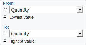
- Avoid using range prompt controls that contain radio buttons. Figure 1. Range prompt with From and To sections

When users tab to a radio group, the focus should be in the selected radio button. In the case of range prompts, for both the From and To sections, the radio button groups start first in the tab order. However, the secondary input elements, which can be text boxes, drop-down lists, date edit boxes, and so on, are located before the selected radio button in the tab order. Instead of going to the selected radio button, the focus goes to the secondary input element. As a result, users using a screen reader do not know that the input element is one of two options.
