Create a dashboard report to show a high-level
graphical view of company performance indicators.
By
using dashboard reports, users can
- drill up and drill down to see higher and lower levels of detail
- navigate to other targets, including IBM® Cognos® Report Studio reports, IBM Cognos Query
Studio reports, and IBM Cognos Analysis Studio analyses
- include multiple charts derived from different data sources in
a single report
Dashboard reports are not the same as workspaces or dashboards
created in IBM Cognos Workspace. Dashboard reports display
several different report objects in one report, but the information
in the report is static. Workspaces created in Cognos Workspace are a collection of IBM Cognos content
that you assemble into an interactive workspace. Content is displayed
in widgets. For information about creating interactive and sophisticated
workspaces, see the IBM Cognos Workspace User Guide.
You can also create dashboards within IBM Cognos Connection. In these dashboards,
content is displayed in portlets within pages. For more information,
see the IBM Cognos Connection User Guide.
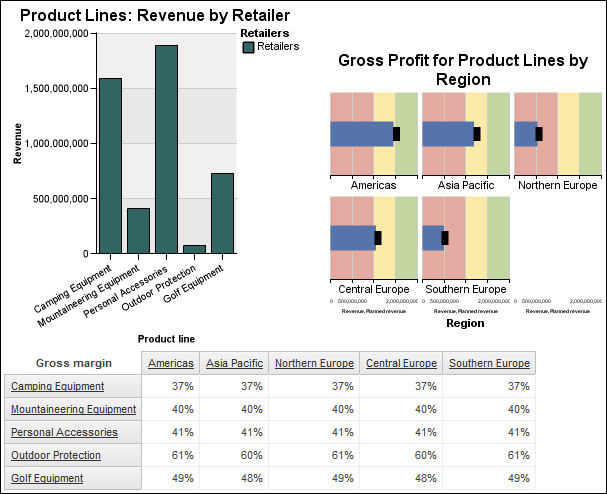
In
this topic, you learn how to create a dashboard report so that users
can examine important sales data in a single view.
It should
take 15 to 20 minutes to complete this topic, and your dashboard report
will look like this.
Procedure
- Create a blank report with the GO Data Warehouse
(analysis) sample package.
- Add a column chart, a bullet chart, and a crosstab.
- Drag the following items to the bullet chart:
- Revenue (in Sales and Marketing
(analysis), Sales, Sales
fact) to the Bullet Measure drop
zone
- Planned Revenue to the Target
Measure drop zone
- Product line level (in Products)
to the Series (matrix rows) drop zone
- Region level (in Retailers)
to the Categories (matrix columns) drop zone
- Drag the following items to the column chart:
- Revenue (in Sales fact)
to the Default measure (y-axis) drop zone
- Product line level (in Product)
to the Categories (x-axis) drop zone
- Retailers level (in Retailers)
to the Series (primary axis) drop zone
- Drag the following items to the crosstab:
- Gross margin (in Sales fact)
to the Measures drop zone
- Product line level (in Product)
to the Rows drop zone
- Region level (in Retailer site)
to the Columns drop zone
- Click the bullet chart.
- Set the Size & Overflow property
width to 300 px and height to 300
px.
- Set the Title property to Show.
- Double-click the chart title and type the following text:
Gross Profit for Product Lines by Region
- Set the Font property for the chart
title to Arial, 12pt, Bold.
- Set the Padding property for the
left and bottom padding to 20 px.
- In the Bullet Indicators property,
set the bar width to 30%.
- Click the chart, click the Chart Palette Presets icon
 , and click Contemporary from the available
palettes.
, and click Contemporary from the available
palettes.
- Set the Size & Overflow property
width to 300 px.
- Set the Title property to Show.
- Double-click the chart title and type the following text:
Product Lines: Revenue by Retailer
- Set the Font property for the chart
title to Arial, 12pt, Bold.
- From the Data menu, click Drill
Behavior.
- Select the Allow drill-up and drill-down check
box.
- Run the dashboard report to view what it will look like
for your users.
Results
Users can drill up or drill down on values in the report
to view related information.
For more information, see the
following references: