
Pie Charts
Pie charts are useful for highlighting proportions.
They use segments of a circle to show the relationship of parts to the whole. To highlight actual values, use another chart type, such as a stacked chart.
Pie charts plot a single data series. If you need to plot multiple data series, use a 100 percent stacked chart.
Reports in PDF or HTML format show a maximum of 16 pie or gauge charts. If you need to see more, run the report in Microsoft Excel spreadsheet software Single Sheet format and they all appear in the report.
The following example shows that the largest proportion of revenue comes from the Americas, followed by the Asia Pacific region.
Figure 1. An example pie chart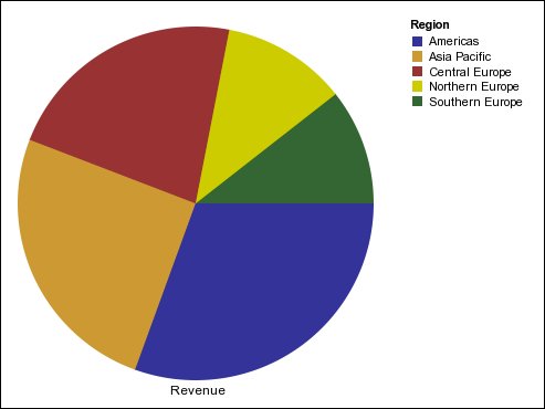
Pie charts can plot data using standard, 100 percent, and three-dimensional configurations.